 Français
  Deutsch
  English
 How to Match Your Bedding Like a Pro : A Simple & Stylish Guide
Matching your bedding is a bit like putting together an outfit in the morning : some people effortlessly mix colors with their eyes closed, while others end up with a pink pillowcase, an orange duvet cover, and a turquoise sheet (yes, we see you). But don’t worry — with a few smart tips and a dash of creativity, turning your bed into a decor masterpiece is easier than you think. And no, you don’t need an art degree to get it right.
Why Matching Your Bedding Actually Matters ?
We’re not talking about following trends like a decorating catalog — we mean creating harmony in your bedroom so it feels good. Because yes, aesthetics really do impact your well-being.
A well-matched bed means a calmer mind
When you get home after a long day, your brain is overloaded. A bedroom with a consistent style — soothing colors and cozy textures — sends a clear signal to your mind: “You’re safe here. You can relax.” And honestly, isn’t that exactly what we need ?
The mood-boosting power of color
Your bedding is like an artist’s palette… except you sleep in it. Warm shades like rosemary green or soft peach encourage relaxation. Neutrals create a cozy cocoon effect. And carefully chosen patterns ? They energize or spark curiosity — like a square of chocolate after a long day.
The cocoon effect, the real trend of 2025
Cold minimalism is out. In 2025, it’s all about comfort — soft, inviting spaces that make you think “please don’t make me leave this be”. Matching your bedding is about creating a little bubble of calm, where recharging becomes effortless.
Common Bedding Mistakes We See (Way) Too Often
Matching is great — but beware of decor slip-ups. Sometimes, in trying too hard, you end up with a visual disaster.
Pattern overload
A zebra-print cushion, polka-dot duvet, floral pillowcase… and striped sheets. STOP. Too many patterns kill the pattern. Your bedroom is not a theme park. Keep it balanced. One bold print = a calm, solid base to ground it.
Tone-on-tone that turns into a snooze-fest
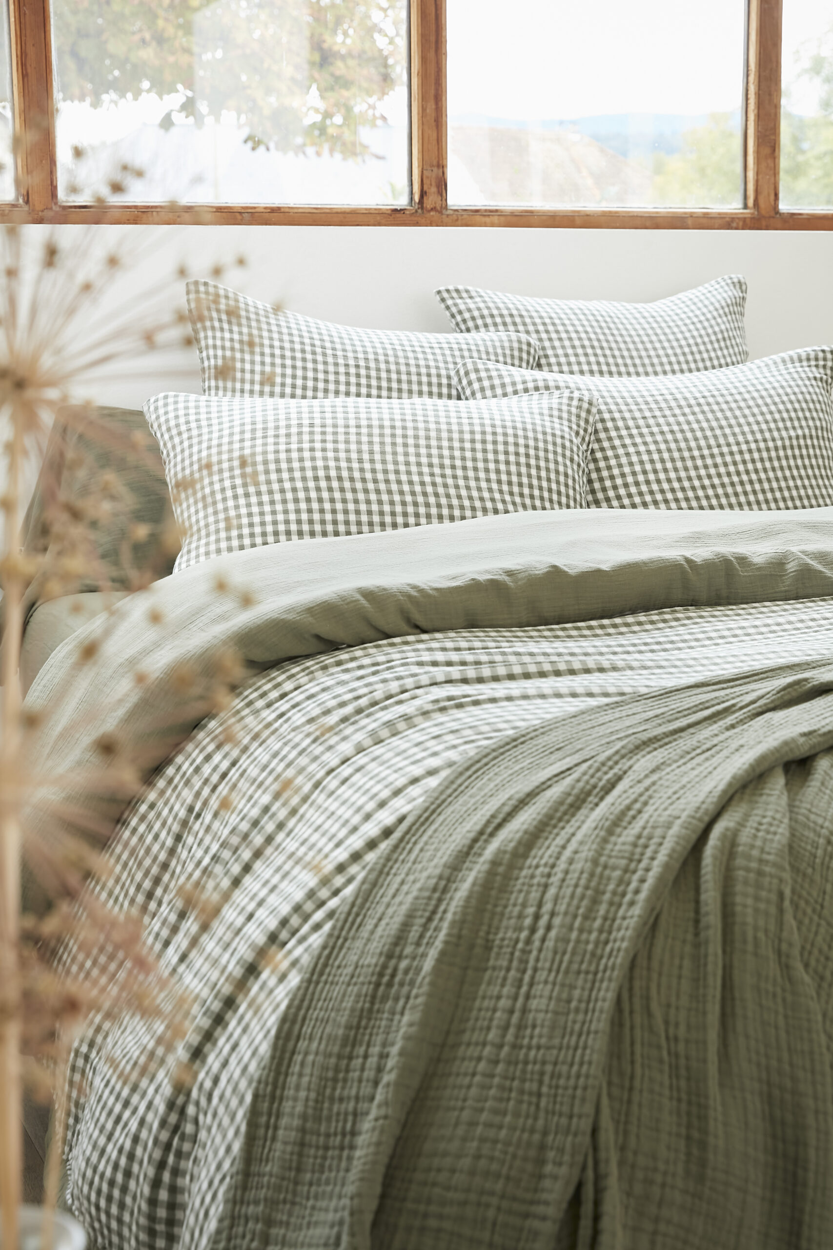
Pairing beige with beige might feel safe, but it can quickly get too sleepy — and not in a good way. Contrast is key. Mix tones, textures, and depths. Think washed rosemary linen with lighter cushions, for instance — instant life and warmth.
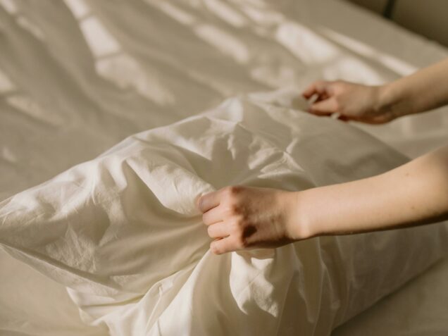
Forgetting about texture (yes, it matters !)
We tend to focus on color and forget texture. But mixing velvet with washed linen ? That’s the secret sauce that adds depth and character. Style isn’t just about how it looks — it’s how it feels, too.
The No-Fail Guide to Matching Your Bedding – by L’effet Papillon
You don’t need a fashion degree to have a gorgeous bed. All it takes is a few solid basics and the right products (hi, that’s us 👋).
Start with a solid base (hello GAÏA !)
Always begin with a classic : a plain bedding set in a soft, versatile color. Our GAÏA collection is perfect for this — 17 shades, from subtle neutrals to bold pops. It’s your canvas, your foundation. Once it’s in place, you can build your look around it.
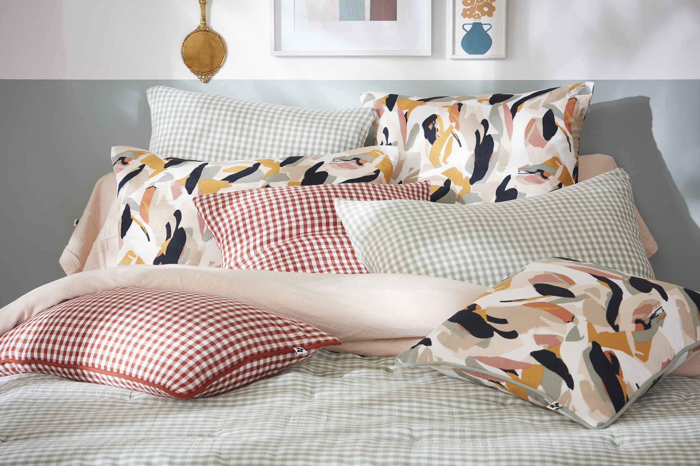
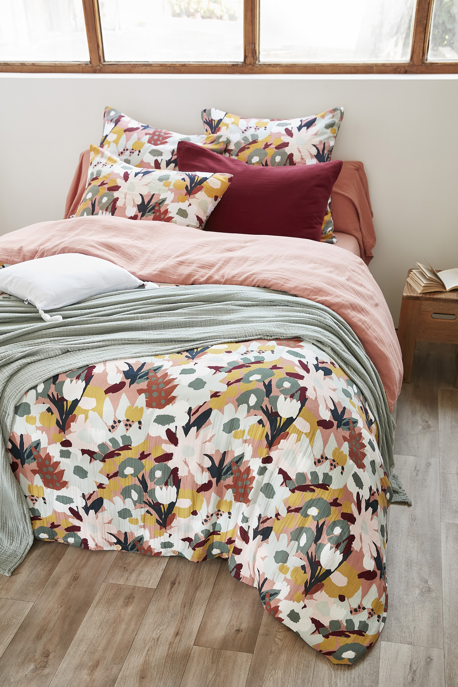
Add a dash of pattern (thank you Léane, Julia, Clarence & co)
Pattern is the fun accessory that gives your bed a boost. A Léane cushion cover in printed cotton gauze, a Julia duvet cover, or a Clarence pillowcase — the options are endless. And since all our prints are designed to pair beautifully with the GAÏA solids, there’s zero risk of a style misstep.
Pro styling tip : use fabric by the meter for subtle coordination
Want a wow effect without overloading the look ? Try our fabric by the meter to create a custom accent piece : a bed runner, a decorative pillow, or even a little slipcover for a footstool. A subtle pattern echo — simple, stylish, and super effective.
But What About Comfort ?
Because a pretty bed that’s uncomfortable is like wearing size 6 heels when you’re a size 9 — pointless (and painful).
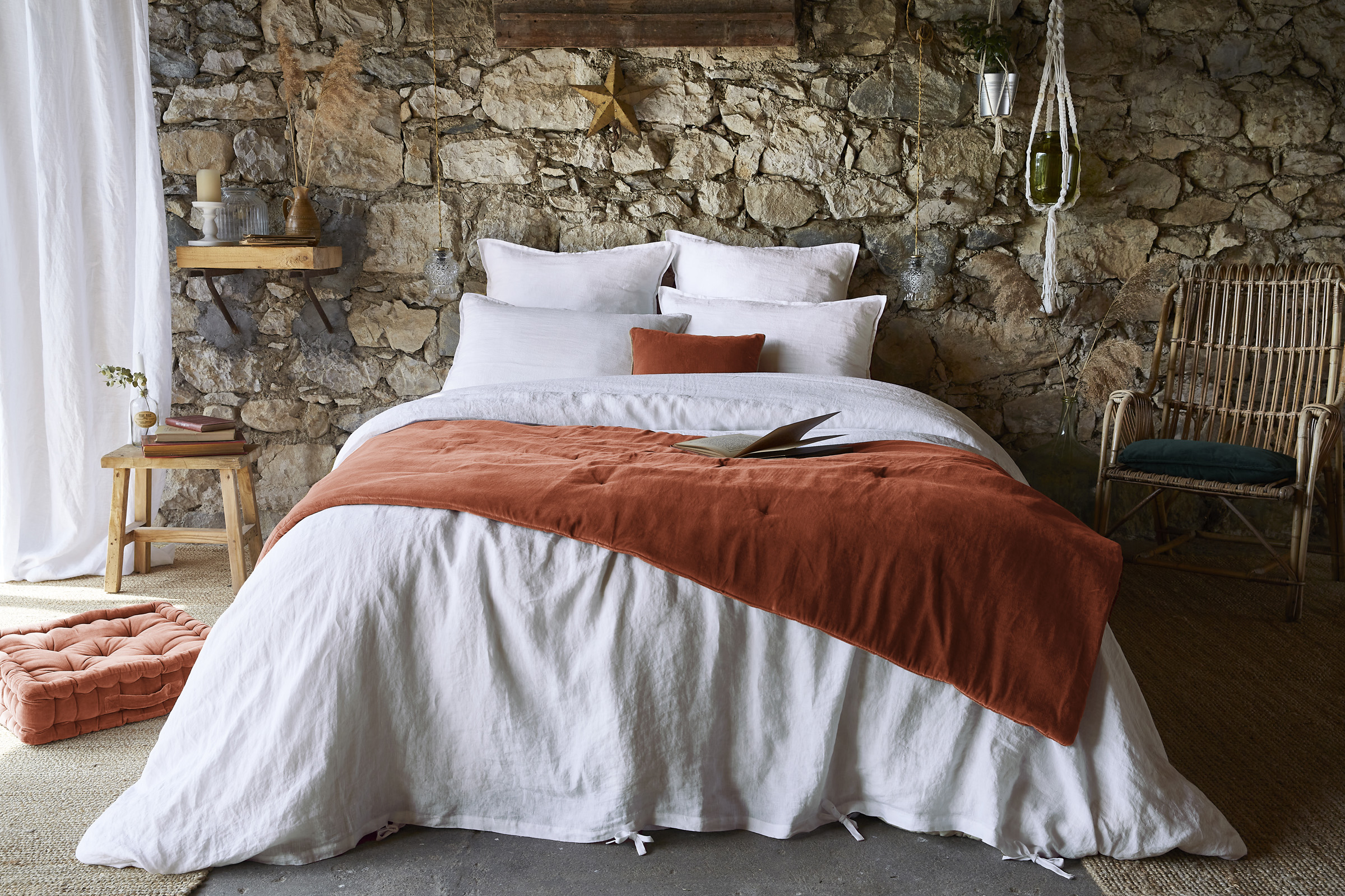
Matching your bedding should look good — and breathe too (shoutout to washed linen)
Our go-to fabric for in-between seasons ? Washed linen. It’s temperature-regulating, elegant, breathable, naturally crinkled (hello, no ironing), and best of all — it ages beautifully. Basically, it’s the George Clooney of bedding.
Fabrics that make naps softer
Pair cotton gauze pillowcases with a washed linen duvet cover and a fluffy decorative cushion. The result ? A bed that calls for a midday nap. And honestly, that’s an art in itself.
Match texture too : matte, crinkled, embroidered ?
Mixing textures adds true visual richness. Blend linen with soft cotton and the delicate embroidery from our Comptoir des taies collection. It’s a treat for both the eyes and the skin.
Bonus Tips to Become a Bedding Pro
Because at L’effet Papillon, we love slipping in a few extra secrets…
The folding trick that changes everything
A neatly folded sheet set = less stress. Store each set in its matching pouch so there’s no more treasure hunting in the closet. Bonus tip : the GAÏA pouch is perfect for this.
Rotate your colors with the seasons
Spring ? Go for fresh shades like Pampa or Rosemary. Winter ? Try Midnight or Granite for a warm, cocoon-like feel. And remember : switching your duvet cover is like changing your hairstyle — it just feels good.
The accessory that makes all the difference
A decorative cushion can turn a dull bed into the star of the room. Try, mix, switch things up — the possibilities are endless (and always stylish).
So, Match It or Wing It ?
✔️Key points :
- A solid base to set the tone
- One or two well-chosen patterns for a pop of personality
- Natural, breathable fabrics for comfort
- Subtle but impactful decorative touches
❌What to avoid :
- Pattern overloas
- Flat, monotone tone-on-tone
- Random mixing with no common thread
Conclusion :
Matching your bedding is more than just a decor choice – it’s a form of self-care, a small gesture that turns the everyday into something soft and soothing. So, ready to compose your most beautiful bed ensemble yet ? And if you’re ever unsure, we’re always here to inspire you over at @leffetpapillonroanne.