Vintage in decor : Top or flop ?

Vintage is making a big comeback in our interiors, and colors play a key role in this trend. Warm, deep hues and nostalgic pastel tones add character and a retro-chic touch to your decor.
The key colors of vintage style
Earthy and warm tones : Terracotta, ochre, or olive green evoke the ’70s and create an authentic atmosphere.
Powdered pastels : Antique pink, sky blue, soft yellow… These shades bring softness and lightness, perfect for a retro-inspired bedroom.
Deep and contrasting colors : Burgundy or forest green, paired with luxurious materials like velvet or washed linen, enhance vintage elegance.
Top ou Flop ?
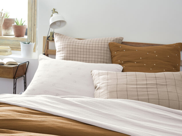
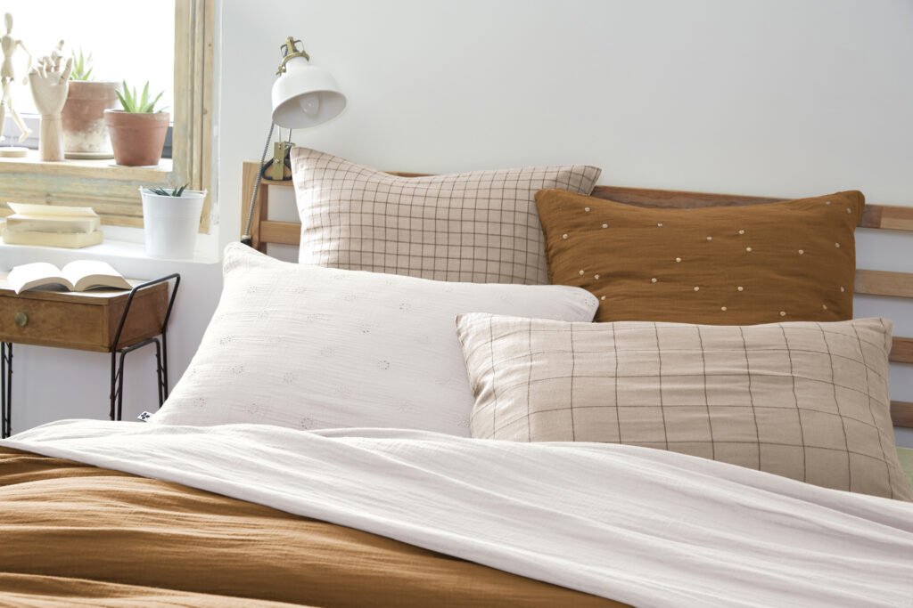
Vintage in decor is a big YES, but only if adopted in moderation. The risk ? Falling into the total “flea market” look, which can quickly weigh down a room. The trick is to mix retro elements with modern touches. A cotton gauze duvet set in warm colors, delicate cushions, or textured curtains that add softness.
To adopt : Natural materials, soft or deep colors, and a few statement pieces like a textured throw or an embroidered cushion cover.
To avoid : Too many vintage elements together, faded colors lacking vibrancy, or an excess of busy patterns.
How to integrate this trend without a misstep ?
- With bedding in retro hues, like our cotton gauze sets or our pillowcase counter.
- By mixing L’effet Papillon decorative cushions in soft and natural tones to add depth to your bed or sofa.
- By choosing vintage-toned curtains or throws to bring texture to your interior.
- Or by pairing these colors with dark wood or rattan furniture for a harmonious decor.

Decor tip : For a perfect balance, pair a bold shade with neutral tones like beige.
At L’effet Papillon, we love playing with colors to create unique atmospheres. And you, vintage in decor, is it a top or a flop? Let us know on our Instagram : @leffetpapillonroanne !
 Français
  Deutsch
  English